The CSS float property is used for controlling the flow of floated elements in your web page, allowing you to place an element on the left or right side of its container.
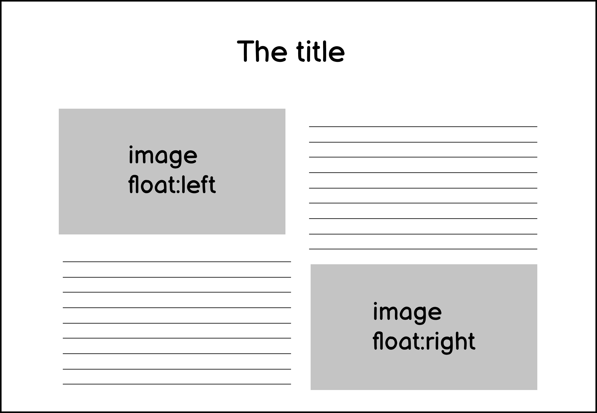
The property is created to mimic the style of a newspaper page where an image is placed on the left or right side of a text:
For example, suppose you have a paragraph (text taken from Wikipedia) with an image on the left side as follows:
<p>
  The lion (Panthera leo) is a large felid of the genus Panthera
  native to Africa and India.
</p>
<p>
  <img src="image.jpg" alt="A lion">
  It has a muscular, deep-chested body, short, rounded head, round ears,
  and a hairy tuft at the end of its tail.
</p>
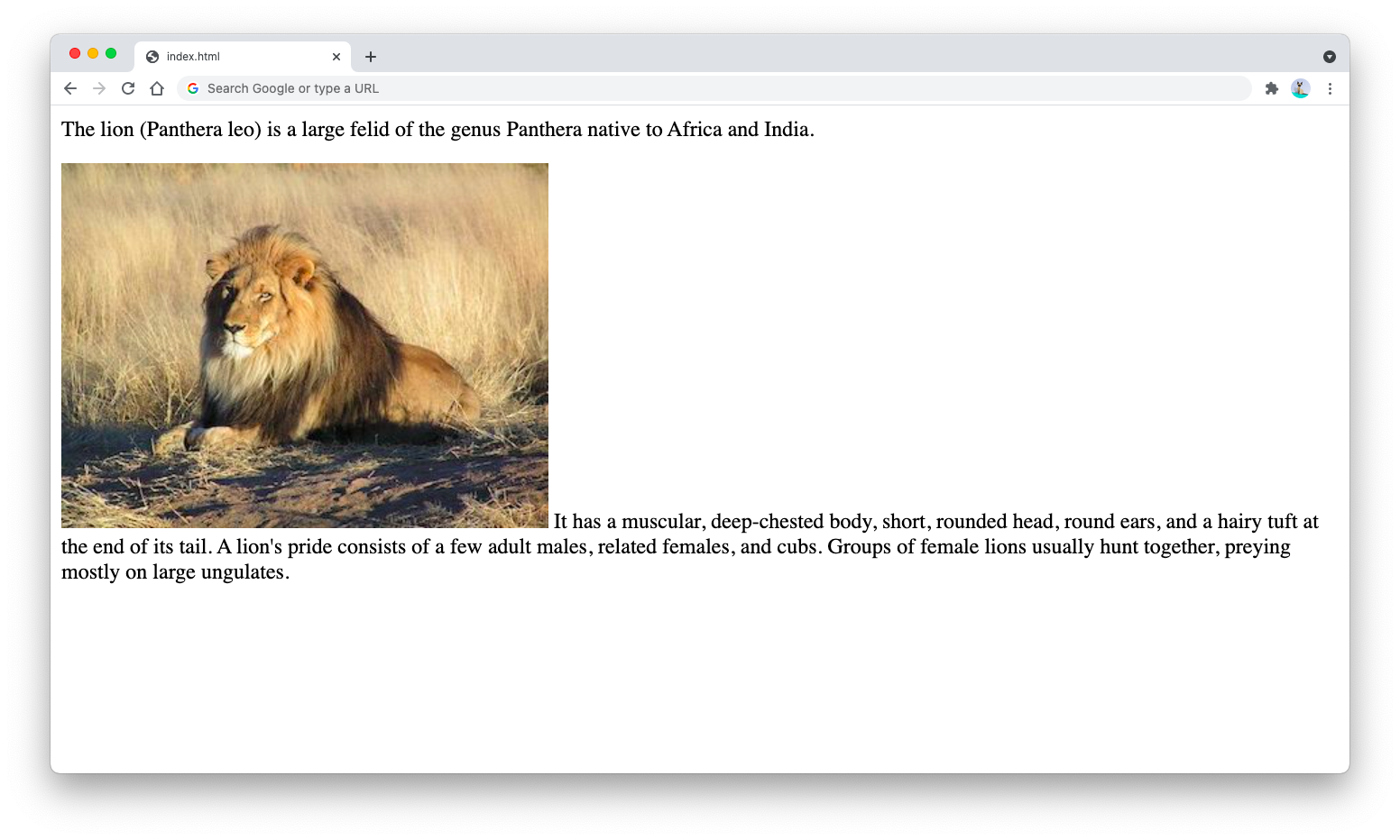
The output of the HTML document will be as shown below:
As you can see from the output above, the image inside the second paragraph is placed on the left side of the text, but the text started right at the bottom side of the image.
This is because the browser treats both image and text inside the <p> tag as inline elements. They are treated as on the same level.
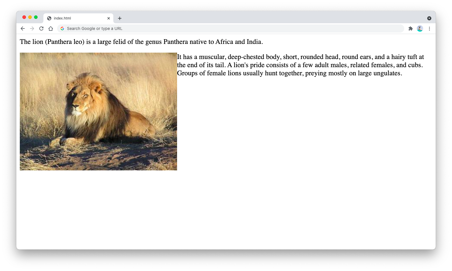
To make the text started at the top side of the image, you can apply the float:left CSS property to the image as follows:
<p>
  The lion (Panthera leo) is a large felid of the genus Panthera
  native to Africa and India.
</p>
<p>
  <img src="image.jpg" style="float:left;" alt="A lion">
  It has a muscular, deep-chested body, short, rounded head, round ears,
  and a hairy tuft at the end of its tail.
</p>
The output will be as shown below:
A floated element is taken out of the normal element flow but still placed relative to the container. The float property accepts one of the three possible values:
float:leftwill place the element on the left side of its containerfloat:rightwill place the element on the right side of its containerfloat:nonewill stop the floating, just like when you don’t use the property at all
Aside from floating images, the float element can also be used to float <div> elements to form a two-column layout with a main and a sidebar.
Take a look at the following code and notice the use of float property in main and sidebar CSS classes:
<style>
  .header {
    background-color: cornflowerblue;
  }
  .main {
    background-color: palegreen;
    width: 70%;
    float: left;
  }
  .sidebar {
    background-color: violet;
    width: 30%;
    float: right;
  }
  .clearfix::after {
    content: "";
    clear: both;
    display: table;
  }
  .footer {
    background-color: crimson;
  }
</style>
<div class="header">
  <h1>Header</h1>
</div>
<div class="clearfix">
  <div class="main">
    <h2>Main content</h2>
  </div>
  <div class="sidebar">
    <h2>Sidebar</h2>
  </div>
</div>
<div class="footer">
  <h2>Footer</h2>
</div>
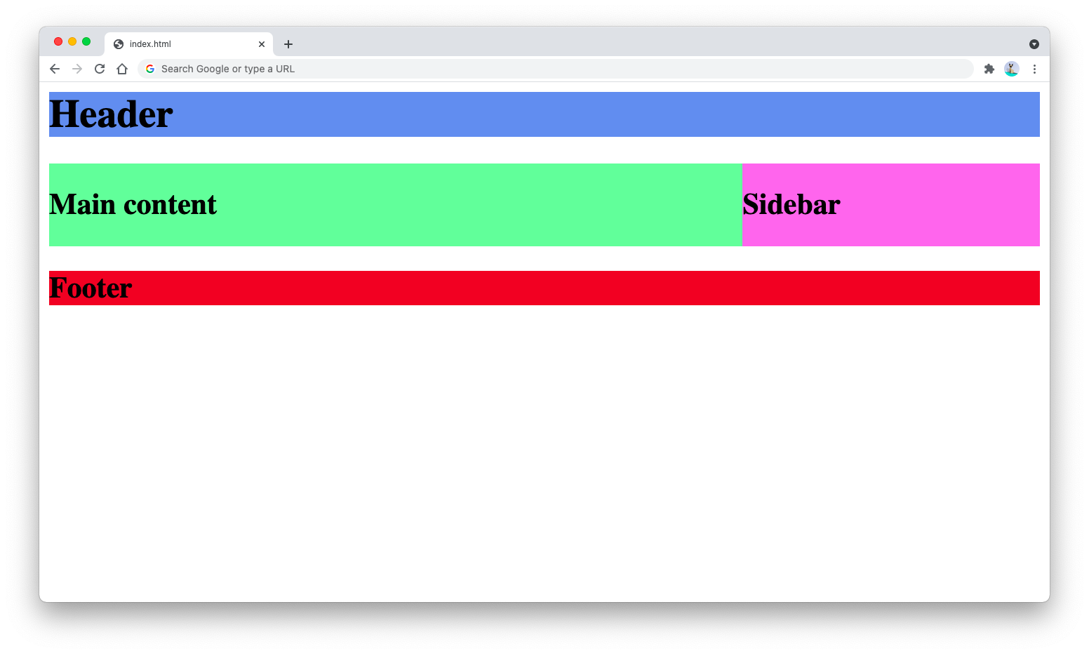
The result of the HTML above will be as follows:
The main and sidebar classes use the float property to float themselves toward the left side and right side of their container.
The clearfix class is used to contain the floating elements. The clear property will prevent the floating element from affecting the element next to it (in this case, the footer element won’t be wrapped together with the main and sidebar elements)
You can learn more about the clear property and its use cases here.
To conclude, the float property is a CSS property that’s commonly used for floating elements. It’s particularly useful for creating a web page layout and placing text next to an image.
It can be used to wrap any elements next to each other, including tables, lists, and general <div> elements.
*Note: The lion image above provided By Kevin Pluck - Flickr
